The most important ingredient on your resume is concise, well-written content, without a doubt. But all of that hard work you put into creating your resume content is meaningless if your key points go unnoticed.
Recruiters and hiring managers see so many resumes that it can be difficult for them to absorb your qualifications when they skim your material. Yes, that’s right - skim. Most of the time, resumes are not read thoroughly and completely. Resumes are only glanced at for a few seconds, especially during the first sorting exercise or review.
By taking the time to apply the appropriate formatting, you help draw potential employers’ eyes to the most important information, and ensure that your impressive achievements are not overlooked.
As an experienced career coach and resume consultant, here are formatting strategies I have used to quickly communicate a candidate’s qualifications, and generate higher interview request rates:
1. Font
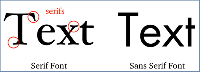
You can make your resume more attractive AND distinctive just through your font choice. Times New Roman is overused, and it is a serif font, which can be more difficult for tired eyes to read than a sans serif font. Certain serif fonts such as Garamond and Cambria may still be fine, especially in your headings.
Some good sans serif choices for the body of your resume include Tahoma, Verdana, Calibri, and Arial. The ideal font size will depend on the font choice and how much text you have, but a rule of thumb is to stay between nine point and 12 point. Header text can be larger, from 14 to 20 point, to help organize the content for the reader.
More on the best resume fonts from Hubspot
How to choose the best fonts for your resume, by Adobe
2. Color
Resumes with the appropriate use of color tend to be viewed longer than those with only black and white. I recommend that you only add color to your section headings (Professional Experience, Education, for example) or sub-headings in each section (such as employer names and the job titles). Footers, horizontal rules, and box or table borders also present an opportunity to inject a little color while keeping the style professional. Color can be subjective, but I believe that navy, burgundy, and dark green are appropriate for a professional look.
3. Bullets
As an alternative to a long, wordy paragraph listing your skills or accomplishments, a bulleted list is often a better way to present such information. It is far easier for the reader to process a neat list among your concise paragraphs. Changing the bullet style to anything but round bullets will make these lines stand out even more. Squares, checkmarks, and arrows are all distinctive, yet don’t take away from the writing. I have also seen bullets in color (see #2 above).
More on using and formatting bullets in MS Word
4. Text features
(Bold, underline, italics, and shading)
If you strategically highlight certain words and phrases, a reader can’t miss them. In most cases, it’s a good idea to help job titles and company names stand out through this type of formatting since it is the most important information a reader is looking for.
There are additional options. For a major quantifiable accomplishment, consider bolding or italicizing the part of the sentence that mentions it to draw the eye to it. You can also bold or underline the scope of your responsibility under each role so the reader quickly notices the important information, such as headcount, or performance metrics.
Help with text formatting in MS Word
If there is something you really want to make sure the reader notices, consider adding shading to the section.
Help with shading in MS Word
5. Brevity
It’s always a good idea to heed the adage “Less is more,” and write concisely in your resume. If a paragraph is more than five lines, break it up into two. If you have a long list of bullets under one position, divide them and group the bullets under two or three topic headings, such as “Leadership”, “Transformation” and “Results”.
More tips for concise resume writing
6. White space
An effectively formatted resume also includes adequate white space, which helps the reader digest the information, whether they’re skimming or reading. To increase the amount of white space in your resume, some tips include using greater than single spacing after each section or paragraph. I feel that bulleted lists work better when the line spacing is set to 1.15 or 1.5. Also, check your margins to be sure there is enough room around the edges of the page. They should be the same size on all four sides, and ideally between 0.5 and .8 inches.
Help with paragraph and line spacing in MS Word
The goal of the resume is to quickly show a reader that you’re qualified for a specific type of job, and motivate them to bring you in for an interview. Once you have written the substance of your resume, spend a little time on formatting to make sure that your relevant qualifications and accomplishments are quickly seen.


Written by Charlotte Weeks
Charlotte Weeks is President of Weeks Career Service, Inc. She specializes in providing C-level executives, association executives, executive directors, VP/senior-level professionals, and aspiring executives with comprehensive career coaching services and high-ROI resumes.


